

IBM Design Studio | Good Things Grocery

Want a more condensed overview?
Check out my project presentation slide deck!
OVERVIEW
My Role
UX Researcher
Service Designer
Timeline
Sept. - Dec. 2022
Team
Kat Brinkley
Wendy Chuang
Tayo Ezekoye
Hingis Chang
Yinuo Zhang
Benyin Luo
Client
Good Things Grocery
Tools
Figma
Miro
Mural
GoodNotes
Background
Our IBM Design Studio team partnered alongside Good Things Grocery (GTG), a local boutique grocery store that has two locations in Lockhart and Martindale, TX. In the midst of the pandemic, local coffee shop owners Taylor and Austin Burge saw a need in their community for healthy, good quality, and sustainable groceries and decided to open up shop to fill this gap.
Problem
Good Things Grocery has to balance not raising prices while still being able to make enough profit to cover costs. Being a small boutique grocery store, GTG struggles with low daily sales numbers.
We found that GTG had organizational issues with their inventory and unclear labels that were not showing the price or missing entirely.
The result:
Difficulty in making informed purchasing decisions
Lack of confidence during the shopping journey
Hesitance to purchase a product
Solution
After we were led to our solution through research and ideation, I designed 3 product labels from products found at GTG that provided our stakeholders with a clear guide to create their own product labels.
Project Constraints
Timeline: 3 months
Major pivot over 1.5 months in. Our timeline got cut nearly in half.
Budget: $0
GTG did not have the resources to allocate a budget for this project.
Users/Customers: Limited exposure
Only access was through the few respondents of our survey.
User testing: participants were chosen based on accessibility and availability to the team.
Our Approach
RESEARCH
Stakeholder Interview
⟡
✦˖ ࣪⊹
✦
Meet Taylor Burge, the owner of Good Things Grocery!
We met with her to conduct a semi-structured interview in hopes of getting a more in-depth look into what her unique goals for GTG were, the challenges they were facing, and what she believed to be their distinctive selling points as a small boutique grocery store. This helped us understand more of the situation from a business perspective.
Here are a few key insights she laid out for us:
Goals

Wants to get in the forefront of people’s minds to “shop local first, then the supermarket”
Thrives more in a crisis mode, like in a pandemic, but wants to operate in a more consistent and sustainable manner
Continue serving their local community well
Challenges
Not enough people making purchases to reach their goals
Indie grocery stores like theirs function at an almost impossible margin, but they cannot raise prices any higher despite rising expenses
People are more fluid in the places they shop at (will also go to HEB, Whole Foods, etc.)
Unique Offerings

Carries brands and products unavailable in large chain grocers like HEB
Beyond providing provisions, GTG acts as a cozy and inviting gathering place for local residents that helps to create identity in the neighborhood
Proudly houses many healthy & quality products sourced locally
Our Initial Approach: Where We Went Wrong

Above is the TL;DR. For more information on our initial process, click through -->

This is how we originally gathered participants for our user interviews


Although these insights are exclusive to our initial interviews, they still served to inform some of the design decisions we'd make in our solution

Our Revised Approach: Where We Started Going Right
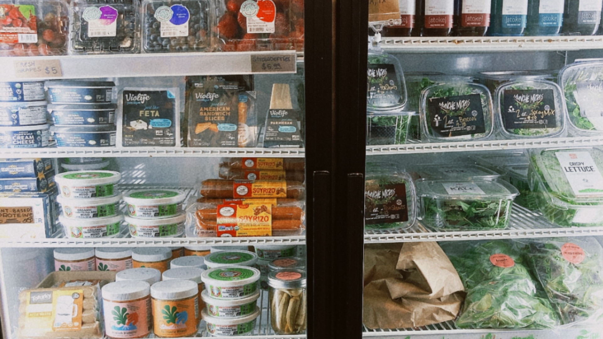
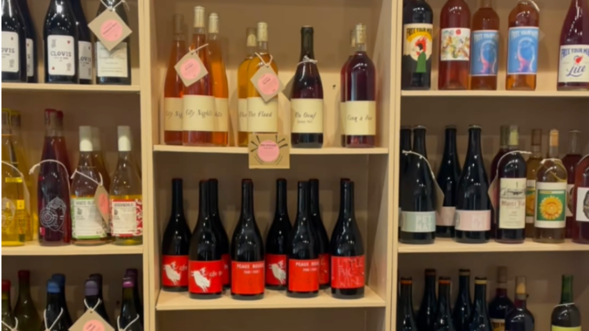
Field Visit
We planned a visit to Good Things Grocery to better understand the store layout, observe customers’ purchasing behaviors, and identify any needs we’d want to address and improve. Before our visit, we also decided as a team to take notes of our own experiences as customers ourselves—all of which would later be super helpful to us when we decided to pivot our focus on both the problems we initially defined and for whom we were designing for.
˶ᵔ ᵕ ᵔ˶ Here are some pictures from our visit:
Here are a few things we noted during our visit to keep in mind for later:
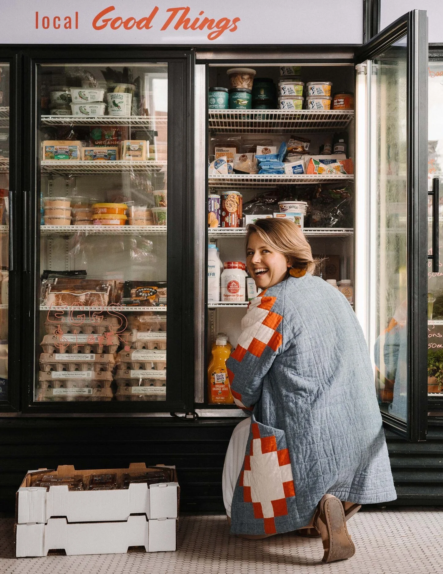
They had a healthy array of various inventory that felt a bit randomly scattered throughout the store
There were missing item labels and prices on a significant amount of products located around the store
Customers shopping around did not seem to be in much haste. Those who arrived with others often took their time to discuss items they saw with the people they were with
You could hear customers and staff regularly engaging in conversation with each other
GTG had a few of their own freshly homemade products available for sale
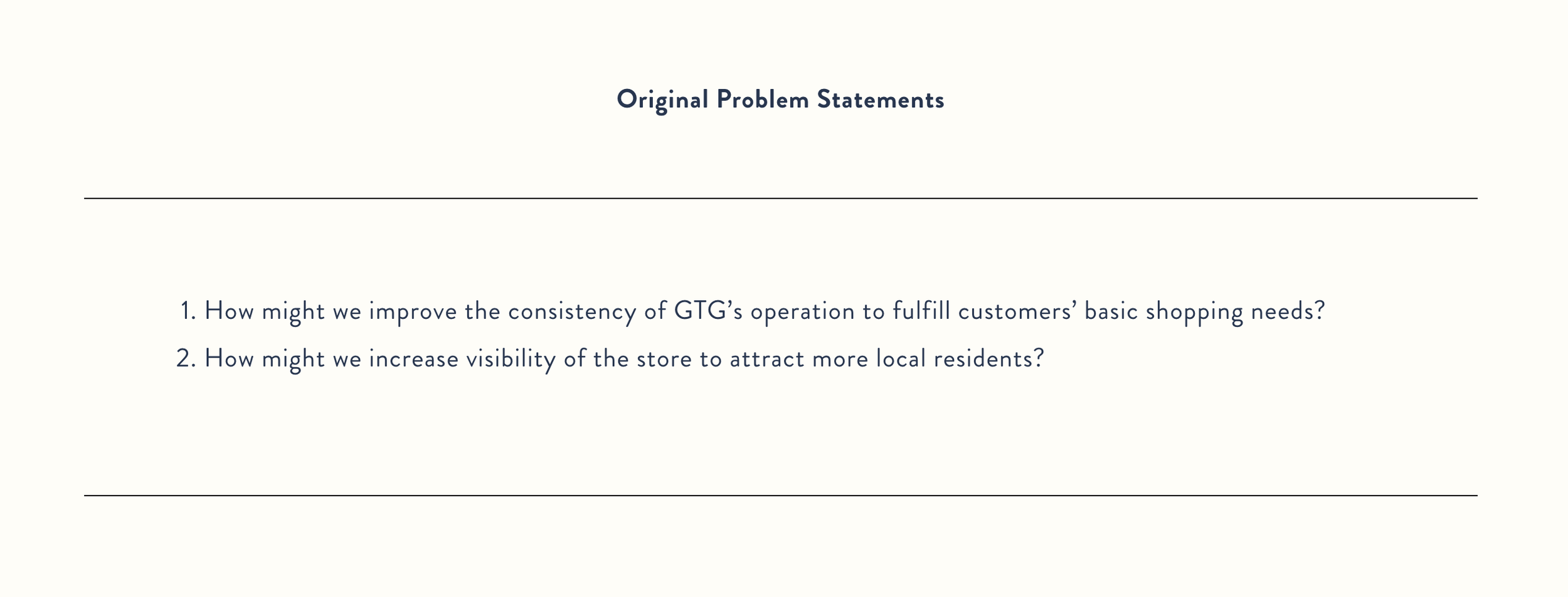
Revised Problem Statements
How might we better organize GTG so that customers can navigate and shop more effectively?
How might we strengthen the connection between GTG and their customers?
Empathy & Affinity Mapping
Note that there’s a common theme of novelty, yet also disorganization, in the overall experience of the store.
Persona
Since we first realized our original persona represented already highly loyal and engaged customers of GTG who were considered “promoters” based on the NPS (Net Promoter Score) metric, these were the people we didn’t need to focus most of our attention on to strengthen GTG’s connection with. Instead, we concurred that the “passives,” those who are satisfied with GTG but not enough to recommend them to others and actively make repeat purchases, were the customers we wanted to design around.
This could offer a unique opportunity for Good Things Grocery since passives can be converted into promoters with the right approach, so leaning into this could be very beneficial to them and the customers alike.
Journey Mapping
I designed our journey map based on our research which helped us see that our focus should target the “Explore” and “Select” phase of the customer’s shopping journey. These are the stages with the most painpoints and negative experiences to ease.
DESIGN
Defining Goals - IBM’s “Hills”
We wanted to keep goals in mind so we didn’t lose sight of our direction when exploring ideas and designing, so we used IBM’s “Hills” framework to help us. “Hills” are essentially statements of intent written as meaningful user outcomes. They consist of 3 elements: the Who, the What, and the Wow.
We jotted down and brainstormed who our users were, what need they were trying to meet, and determining the differentiating factor from competitors as a measure of success.
We came up with 3 Hills with the “Who” in blue, the “What” in green, and the “Wow” in pink:
Priscilla, the passive user, makes GTG her primary grocery store she visits on a regular basis because she can shop seamlessly and efficiently there.
The more expensive price tags are matched by an equally valuable shopping experience that Priscilla willingly spends at least $50 on her weekly grocery shopping trips to GTG.
Social media posts about GTG are shared with new potential customers by Priscilla as she consistently experiences positive interactions with other people and products at GTG.
Ideation
As a team, we engaged in a few different rounds of ideation and design thinking exercises.
For one of our ideation sessions, we performed an iterative round robin method of brainstorming where we passed our original ideas to our teammates and built our ideas on top of each other from an initial “How might we” prompt.
In another round of ideation, we conducted a design sprint method of ideation called Crazy 8’s for rapid idea generation hoping to generate some more out-of-the-box ideas that we might be able to implement. At the end of the session, we came back together to share our ideas with each other and vote on the ones we liked the most. We then clustered ideas together by theme to get a bigger picture of the variety of them. We created a prioritization grid to narrow down what we thought were potentially viable solutions.
After these first rounds of ideation, we thought our ideas were too conceptual and narrow
So we gathered again to “zoom out” and broaden our scope to see how we might address the larger issues of organization and lack of information we discovered in our research.
We made a plot diagram with an example scenario that helped us visualize Priscilla’s user journey based on points such as the exposition, rising action, climax, falling action, and resolution. It helped make it obvious that we had to choose solutions that addressed the problems with the highest impact.
During another round of ideation, we came up with 5 additional solutions and voted for the ones we liked the most. Each team member was allowed 2 votes which resulted in the following:
“Sometimes the simplest solutions are the most impactful”
Ultimately, we decided that the solution that tackled the main problem of disorganization while also strengthening some sort of connection with customers was the most straightforward one—and the simplest. Sometimes the simplest solutions are the most impactful. While we believed the other solutions also added value and stemmed from unique ideas, we realized that improving the display of important information to customers was the most crucial as it would lay the foundation for an enjoyable shopping experience. So we wanted to focus on this as our primary solution.
Storyboarding
As a team, we created a collaborative storyboard birthed from an ideation exercise where we combined our different ideas from different stages of a passive shopper’s journey and worked to see if we could make a story from it. While this is not our official storyboard, I wanted to add it here as it was definitely a fun and creative exercise we were able to do together!
Below is the storyboard we made for Priscilla, a passive shopper who’s visiting Good Things Grocery to see what they have in store so she can cook a new dish for her dinner tonight.
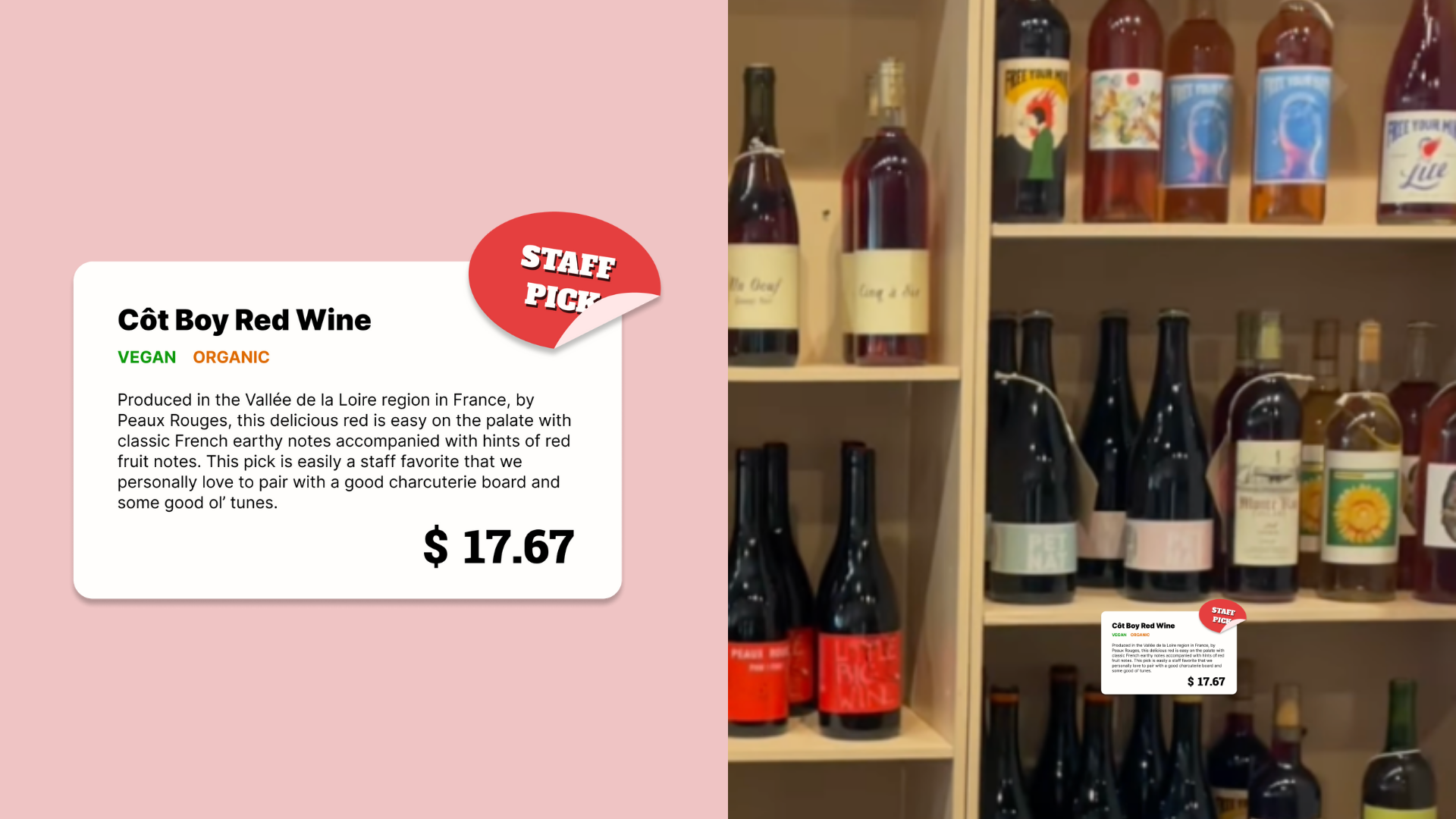
Prototyping
Item label sketch
Mid-fidelity item label
Reasoning behind some of our design decisions:
Item Description
GTG is filled with specialty items (brands and products) that customers are not necessarily familiar with
Descriptions can reduce the uncertainty in purchasing decisions which can help with shopping more effectively
Diet Descriptors
The initial cohort of customers we interviewed represented a more health-conscious demographic that we wanted to consider in our solution
We wanted to make our design accessible for those with special dietary needs/preferences
Sticker
Brings in an aspect of social or community connection where customers get the chance to see what others like/are using
Avenue for bringing attention to particular products GTG wishes to highlight
More likely to encourage customers to try a product out
In order to conduct usability testing sessions, we designed 3 different food item labels to show to participants. We chose to design this variety of items based on the range of items customers would encounter at GTG (from normal, everyday groceries to more specialty food items).
EVALUATE
Cognitive Walkthrough
Our team conducted usability testing with 6 participants through the cognitive walkthrough method. Since we could not carry out this test in person at Good Things Grocery, we conducted the test virtually and had our participants envisioning themselves in each phase of grocery shopping we presented to them.
We moved through a slide of pictures taken from the store and our prototypes and had them follow our pre-planned scenarios and answer questions while thinking aloud to so we could gain insight.


Participants’ data gathered into an affinity diagram based largely on their observations, thoughts, and expectations.
User Feedback
Here are some notable quotes from participants during the cognitive walkthroughs:
Labels
“Labels just need to be clear and straightforward”
“Labels with longer descriptions are not necessary for some sections”
“I probably would not look at the blurb in the label”
“I feel annoyed when labels are not clear”
“There’s not enough labels to know what’s going on”
Price
“Price is the most important factor for me while shopping”
“If I have to ask about the price every time, it might reduce my willingness to purchase some items”
“When there’s no label, I just assume the item is pricey”
“Price tags are extremely important!”
Organization
“I feel like the products are unorganized”
“There’s no consistent organizational structure”
“I have trouble distinguishing different sections”
“The food items are not presented in a normal format. It’s hard to spot things quickly”
“I could find the broccoli easily without labels but I can’t find the queso”
Stickers
“I think the ‘popular’ sticker would definitely catch my eye just because it’s popular. I feel like it’s really influential”
“If I don’t have a specific habit or favorite brand of that thing, I might consider it… [otherwise] I might ignore the ‘popular’ tag”
“Should emphasize local”
“The staff pick sticker is good”
What we learned from user feedback:
Prioritize & condense label information
01
For most goods, concise descriptions offering only necessary information were valued.
Longer descriptions = IGNORED
Only specialty items (eg. wine, uncommon goods)
Longer descriptions = HELPFUL
Leave nothing unpriced
02
The single most important piece of info for shoppers when making decisions is price.
Without readily available prices, participants were less likely to spend on items.
Missing prices caused concern; priceyness may be assumed.
Focus on product organization
03
Product organization was a widely noted problem from the usability tests.
Customers felt like items would not be easily found unless they were already familiar with the store.
This poses a major problem for GTG which needs to build a stronger rapport with their passive shoppers.
Stickers on labels are good!
04
Stickers were easily understandable for participants and were beneficial in acting as visual social proof.
Seen to have an impact on the purchasing decisions and consideration of items for participants.
Helped people feel more connected and participatory through the goods they would buy.
Although we were at the end of our project timeline, I decided to personally revise our product label design based on user feedback from our usability tests for an idea on how we would proceed with testing given we had more time:

Original Label
Revised Label

Original Label
Revised Label
Original Label
Revised Label
Reflection
Further Testing with Customers
Due to time constraints, we could only conduct one round of usability tests. There are a few things I’d hope to consider if we had more time:
Conduct additional rounds of usability testing with existing customers of GTG who are passive shoppers.
Create physical prototypes to conduct usability tests with customers on-site for more accurate and detailed results.
Keep iterating and testing based on feedback until our solutions are thouroughly flushed out and add value to users.
Technical Details with GTG Owners
Before committing to implementing solutions, we would need to meet and discuss the implications of our design solutions and iron out any potential issues with stakeholders. This would require re-evaluating and re-aligning business and design goals.
Because one of the largest identified problems we discovered in our usability testing phase was product and store organization, that would also need to be at the forefront of discussion since it would require more research, ideating, and testing as a physical rearranging of the store’s layout would be in place.
In addition, I’d like to develop a plan to evaluate the success of our design solutions over time to track any progress or improvement in customer experience at GTG as well as their business goals.
Implement Solutions
We would need to work to adapt the solutions with the right resources to properly cover labeling a large number of products, keeping branding consistent, and figuring out a system to accommodate frequently changing inventory. We may also be required to change and adapt our solutions based on how customers’ real-life interactions actually play out and work closely to hone in on helpful resolutions.
Since we only focused on our primary solution, I would also hope to be able to work through and implement our secondary solutions that are fun, creative, and low-risk to generate some buzz and excitement where customers are more involved and can lead to increased interest in GTG’s shopping experience and products they sell. Some of these ideas include a treasure map with novelty items promoted and described, a sample box of uniquely curated items customers can order and test out, and a bulletin board with local brands/producers GTG partners with mapped out to create a sense of community—all of which we explored in our ideation phase.
Personal Closing Thoughts
This was such a rewarding project to work on as it revealed to me how design can help uncover solutions that are sometimes right in front of us that we can’t initially see. Solutions don’t have to be overly fantastical or novel to have impactful results.
I also just loved getting to intimately know Good Things Grocery and their heart and mission for their community while also hearing from the community itself. It got me excited for the future and how I can impact people positively through design.
Lastly, my team and I were challenged with a few twists and turns where we had to ask ourselves some hard questions and learn to let go and pivot, but I’m so proud that we were able to do it and pull through with trust in each other and hard work!